HANKERING FITNESS - FREELANCE
In the process of starting a fitness brand that existed solely as an online shop, my client reached out asking for a stronger brand identity. He explained that the name for his brand—Hankering Fitness—had the right amount of country twang to it and that it hinted at a “craving for fitness.” The brand would target working class folks who like to stay fit, enjoy life, and value the role fitness plays in their day-to-day.
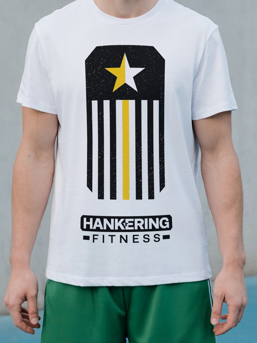
First came the logo. In order to take the idea of craving something and match it to working-class folks and the classic toughness of a fitness brand, I made the traditional five-pointed star a centerpiece of the mark. That star is distinctly American: it’s on our flag, it represents our army, and it appears on many southern state flags as well. The star, split for aesthetic originality, sits within a heavy, but balanced, font and a thick beveled block, forming a logo that exudes strength, accomplishment, and pride.


For the sake of variety, responsiveness, and online social media profiles, I made a reduced version the mark that retains all the core elements:


ARTWORK
As part of the project, I produced various designs for apparel and products that would appear in Hankering Fitness’s online shop. It was a strong way to expand the brand and add new elements that melded nicely with the logo.